The secrets of minimalist websites: why less is sometimes more
Minimalist web design has taken the internet by storm in recent years, and for good reason. The philosophy of "less is more" isn't just about aesthetics; it's about functionality too. In this article, we’ll unveil the secrets behind minimalist websites, their benefits, and why they just work so well.
What is minimalist web design?
Minimalist web design is all about simplicity, clarity, and focus. It’s the art of stripping away the unnecessary and showcasing what truly matters. And no, simple doesn’t mean boring — on the contrary, minimalism allows the important stuff to shine.
Key elements of minimalism include:
White space (negative space): The breathing room between text and visuals, making things easy to digest.
Simple color palette: Neutral tones or a single bold accent color dominate.
Clean typography: Readable, straightforward fonts that don’t try too hard.
Minimal graphics: Only the visuals you absolutely need make the cut.
Why does minimalism work so well?
1. Faster loading times
With fewer graphics and flashy elements, minimalist websites load like lightning. And let’s face it, nobody likes waiting — especially on their phone, when patience is at an all-time low.
2. Improved user experience (UX)
Simple navigation and clear layouts make it easy for visitors to find what they’re looking for. Complex designs? Those just leave people scratching their heads and hitting the back button.
3. Focus on what matters
Minimalism doesn’t distract. When you cut the fluff, visitors focus on your message, product, or service — not that unnecessary slideshow.
4. Sleek and professional look
A clean, aesthetically pleasing design screams "I’m a pro." Perfect for brands looking to build trust and credibility.
5. Easier maintenance
Less complexity means fewer headaches. Updating and fixing a minimalist site is a breeze compared to its cluttered counterparts.
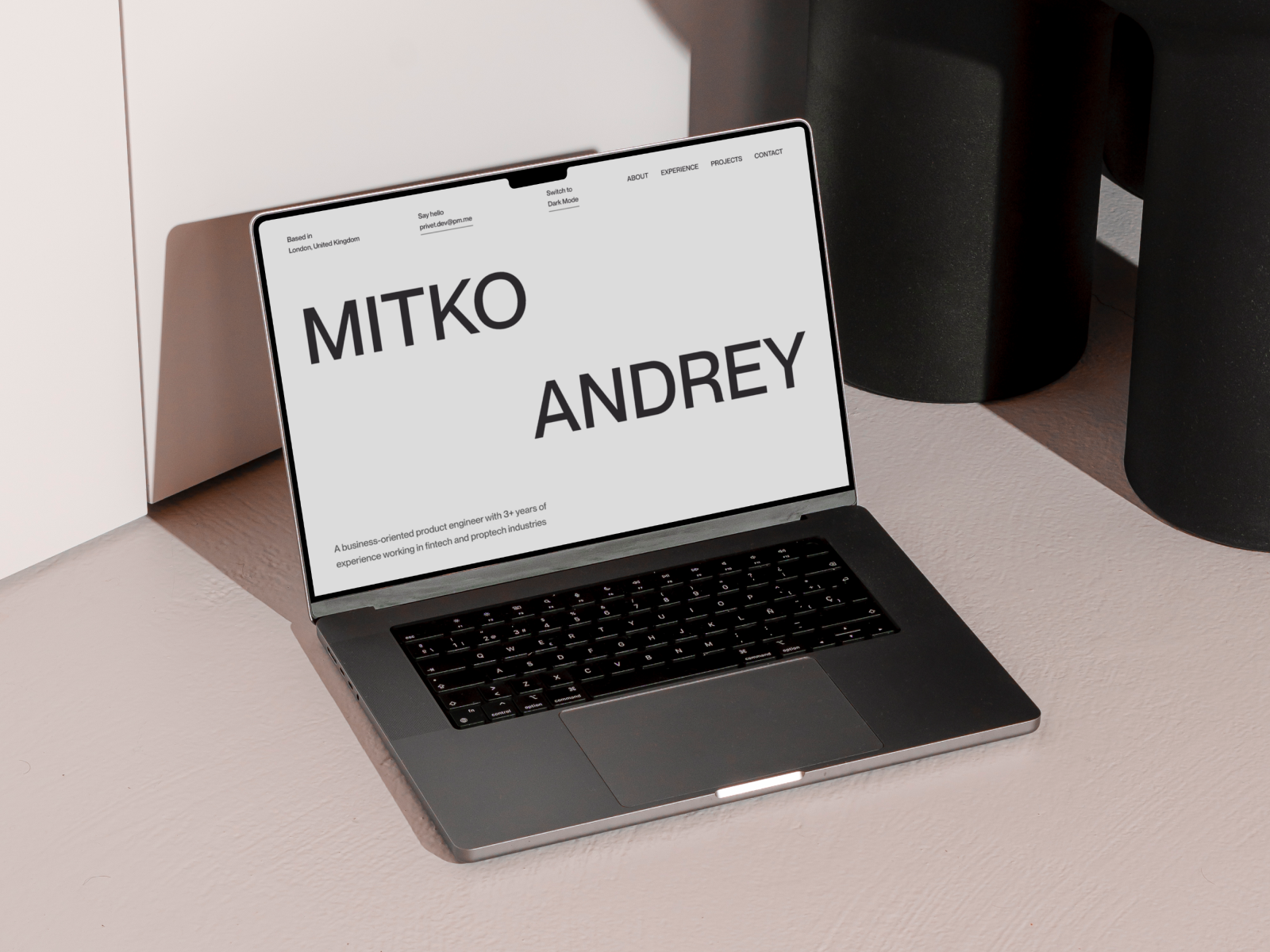
Andrey Mitko's website is a masterclass in minimalism that makes you feel like you're stepping into a zen garden for web design enthusiasts. It’s clean, it’s bold, and it whispers, “You don’t need all that clutter. Let’s breathe.”
How to create a minimalist website
1. Define your purpose
Figure out your website’s main goal or message, then build everything around it. Anything that doesn’t serve that purpose? Say goodbye.
2. Embrace white space
Don’t be afraid of empty areas! They help highlight what’s important and give your site a clean, airy vibe.
3. Stick to a simple color scheme
Keep your palette minimal. Neutral tones with one pop of color are more than enough to grab attention.
4. Opt for clean typography
Choose fonts that are easy to read. Skip the overly decorative ones — nobody wants to squint.
5. Pare down visuals
Use only the essentials: a logo, a strong headline, and a clear call-to-action button (CTA). Done.
Another great example of sleek design, Omnia Group’s website effortlessly blends Italian sophistication with modern minimalism. The clean layout and subtle animations give off a vibe of professionalism with just the right touch of fun.
The magic of minimalist web design lies in its clarity and purpose. It’s not just about looking good (though it does); it’s about working smarter, not harder. Minimalism highlights what’s important, boosts user experience, and speeds up load times. So, if you’re ready to create a website that’s as functional as it is fabulous, get in touch with us. Let’s make less do more — together!✨


